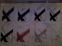
I have produced an A3 typographic poster with elements of my typeface that I created in part one of the brief.
My initial idea behind my poster design was to make it bright; I decided this because my theme is Urban, and if I was asked to describe something Urban I would say bright colours would be used because such things come under the topic of Urban such as; cities, nightlife, dancing, graffiti, music etc.. All of which, in my opinion portray an image of bright, colourful, energetic, busy colours.
I used Illustrator to create my poster design, I did this because I wanted to create a unique image that would bring my poster to life.
I researched Banksy as a part of inspiration for my poster design, I did this because he is a graffiti artist and the spray paint they use inspired me to choose bright colours to use on my poster.
I decided to use neon colours so they would really stand out, I chose to have a black background and have a bold firework like shape in the top corner in neon pink so it stood out really clearly, I then put my letter "e" from my typeface onto the poster in the centre of the firework style shape so it looked like it was bursting out. For the rest of the poster I decided to keep it simple because I didn't want to overcrowd it. So i simply used the same colour scheme to write the name of my font and the call to action.


